


Data is only useful if you can find something in it. Give someone a spreadsheet of a few thousand tickets and ask what’s going wrong, and you’ve handed them a needle in a haystack. Give them a dashboard that organizes the same information visually, and they can spot the problem in seconds. That’s the whole point of a dashboard. It turns a pile of numbers into something you can act on right away.
This matters even more in a helpdesk. You could be handling thousands of tickets a month with a team that ranges from a handful of agents to a few thousand. A manager needs to know how their team is doing right now. A senior executive wants the big picture without digging through ticket logs. An agent just wants to know what’s sitting in their queue. A good dashboard answers all three of these questions at a glance, without anyone having to go hunting.
What a helpdesk dashboard should actually show you
A helpdesk dashboard needs to answer a handful of recurring questions:
How many tickets came in, and how many got resolved?
- What does your CSAT look like?
- How many tickets are still open?
- How productive is each agent?
These are the basics, but the KPIs that matter will shift depending on your team and your goals. A dashboard is only as good as its ability to bend to whatever you’re trying to measure, whether that’s response time, resolution rate, or ticket volume by category.
Build for the person looking at it, not for everyone
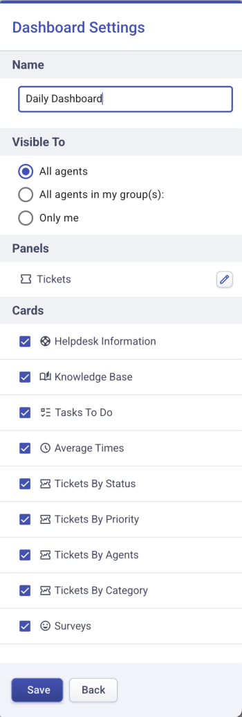
A support manager starts the day differently than an agent. A helpdesk administrator looks at different metrics than someone in leadership. Here’s where most dashboards fall apart. Teams build one dashboard and expect it to work for everyone, from the CFO to the newest agent. It doesn’t. A CFO wants top line numbers, the handful of KPIs that tell them if support is working. A manager wants agent performance and productivity, so they know where to step in. An agent wants their own open tickets and nothing else cluttering the view. If a dashboard can’t be customized for these different audiences, people stop checking it. That’s the real failure mode. Not bad data, just data that doesn’t speak to the person looking at it.
Your helpdesk should let you build multiple dashboards and customize it based on who’s looking.
How to build a dashboard helpdesk agents want to open
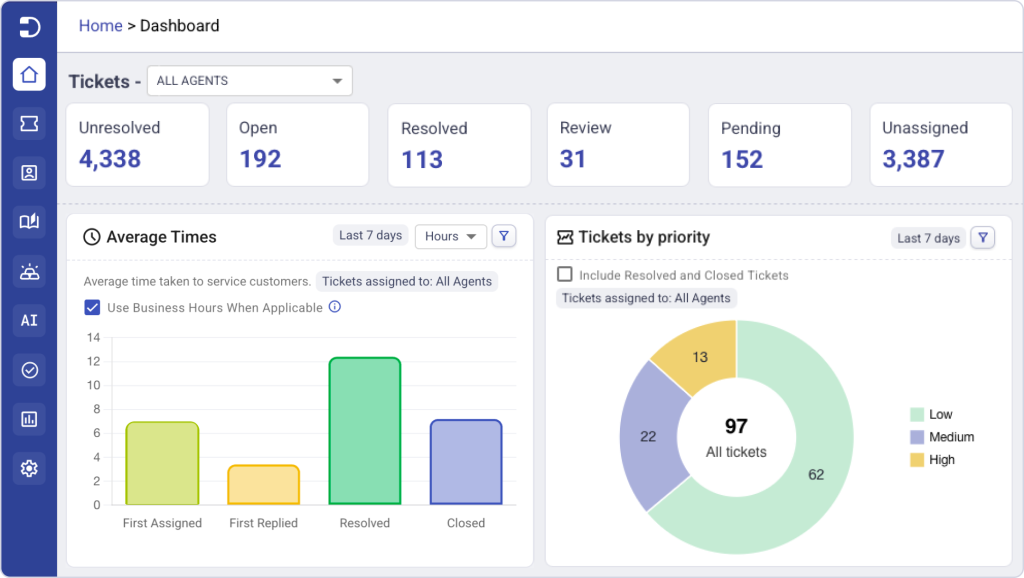
Once you’ve decided what questions each person needs answered, it’s time to choose the sections with your dashboard that support those decisions. Start with your highest-level operational metrics. Open, pending, unresolved, resolved, and unassigned tickets should sit at the top because they immediately tell you whether support is under control or whether something needs attention.
The next layer should explain why those numbers look the way they do. Add reports that break tickets down by status, priority, category, and agent. These views help you understand whether work is piling up in a particular queue, whether high-priority requests are increasing, or whether workloads are evenly distributed across the team. Wherever possible, choose interactive reports that let you click into the data and investigate the underlying tickets instead of stopping at the summary.
Finally, include metrics that help your team improve over time, not just monitor today’s workload. Track response times, resolution times, and SLA performance to understand how efficiently requests are moving through your helpdesk. Monitor customer satisfaction alongside operational metrics so you can balance speed with service quality. If your helpdesk includes knowledge base reporting, task management, or ticket trend analysis, surface those as well. They provide valuable context around recurring issues, self-service adoption, and areas where your team can become more efficient.
Bringing it together with Desk365
Desk365 was built around the idea that a dashboard should work for whoever’s looking at it. Between the customizable home tab, multiple dashboard views, and reporting that covers everything from ticket trends to agent productivity, teams get a clear read on their support operations without extra tools bolted on.
One IT admin using Desk365 said the reporting and analytics gave real time insight that helped with staffing decisions.
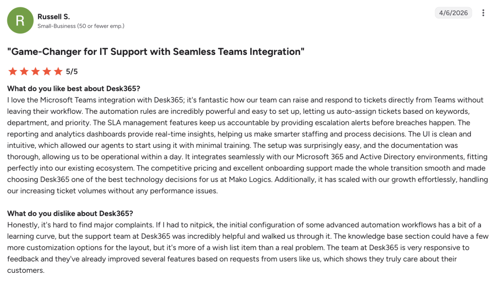
Another small business user said the reporting stayed useful without being overwhelming, giving them just enough data to act on without drowning them in analytics they’d never use.

If your team is still digging through ticket lists to answer basic questions, it might be time for a helpdesk dashboard that actually gets checked. Sign up for a free trial of Desk365 and see what your reporting could look like.




 AI Agent
 Asset Management
 Knowledge Base
 Automations
 SLAs
SLAs
 Customization
 Ticket Assignment
 Reports & Analytics
 Approval Management
 Helpdesk Security
 Explore All Features
 Banking and Finance
 Healthcare
 MSP
MSP Government
  Non Profit
 IT Services
 Customer Support
 Human Resources
 Facilities